Rosetta for developers
What is this repository for?
The idea of working with this repository is to be able to add functionalities (elements, components, modules, etc) to Rosetta UI in a way that all of us involved in development can maintain alignment and consistency.
- Version 1.0
- Learn Markdown
How do I get set up?
The first thing that you need to do is to download a copy of this repository on your local environment by running the following command in your VS code terminal inside the targeted folder: git clone git@bitbucket.org:inboundcycle/rosetta.git.
NOTE: if you're using the Live server plugin ( recommended) to watch your styles changes, the root folder in VS code should be rosetta folder in order for the documentation tool to properly handle assets importations.
Dependencies
Rosetta is build with the help of a documentantion tool called Atlas Guide{:target="_blank} and Sass{:target="_blank} so we're gonna need to install those dependecies:
- The parent of all: Node JS ( LTS version ){:target="_blank} - if you already use sass, you have this installed; if you want to be sure you can use the
npm -vcommand to see which version you have.
As you have downloaded this repository, all you need to do is to run npm install and it will install all dependencies ( for now, will be one):
- Atlas Guide builder{:target="_blank}.
Recommended VS Plugins
- Live server{:target="_blank}: it will launch a development local Server with live reload feature for static & dynamic pages.
- PX to REM{:target="_blank}: coverts px to rem and vice versa.
- Better Comments{:target="_blank}: helps to categorise comments.
- Auto Rename Tags{:target="_blank}: auto rename paired HTML/XML tag.
Deployment instructions
After the setup you're ready to work on the local environment. To start development you need to create a branch and switch to it so you can upload your work after. To do so write this two commands within the folder root:
git branch <branch>: where<branch>is the name of the element, component, module, etc that you will be working on.git checkout <branch>: this will swap to the new branch so you can commit your changes.
After that, we will do a code review and test to make it ready for deployment and we will merge your branch to the main one.
More information about branches here.
Note: the main branch is protected so you won't be able to commit any changes to it.
Before we start
Before we start adding new features to Rosetta we need to know its architecture approach:
Code conventions:
BEM
- DRY-ing the HTML from the CSS you don’t plan on customizing (e.g., behavioral CSS-like transitions, positioning, hover/focus effects), advanced animations/effects.
Utility classes
For frequently-customized properties often used to create component variations (like padding, margin, text-alignment, etc.)
- Elements that are hard to identify with a new, meaningful class name. E.g: you need a parent element with a position relative, you coud do:
<div class="position-relative"><div class="my-component"></div></div>
- Elements that are hard to identify with a new, meaningful class name. E.g: you need a parent element with a position relative, you coud do:
Variables:
Rosetta uses CSS native variables for better customization. Unlike SASS variables, CSS variables:
- Are limited to the element in which they are declared.
- Can be manipulated in JavaScript -> More info
- Can be overwritten, example, in media queries or in a new CSS file. The core of Rosetta customization.
Sass Compilation:
Cause @import will be eventually remove from the language, we need to import files by using @use or @forward rules as we need. More info
We need to make sure that we compile the styles as Compressed css files for CDN purposes.
- Base:
sass --watch src/assets/sass/rosetta.scss src/assets/css/rosetta.css --style compressed - HS:
sass --watch src/assets/sass/rosetta-hs.scss src/assets/css/rosetta-hs.css --style compressed
Atlas Build:
Every time that you change the markdown block documentation in the sass file, you have to run the following script: npm run build-atlas. This will regenerate the hole documentation parsing the markdown again.
No need to do this when you change the actual styles.
Responsiveness:
- Mobile first.
Browser support:
- No IE11 support ( no support for CSS variables) -> more info
Contribution guidelines
Writing a block documentation
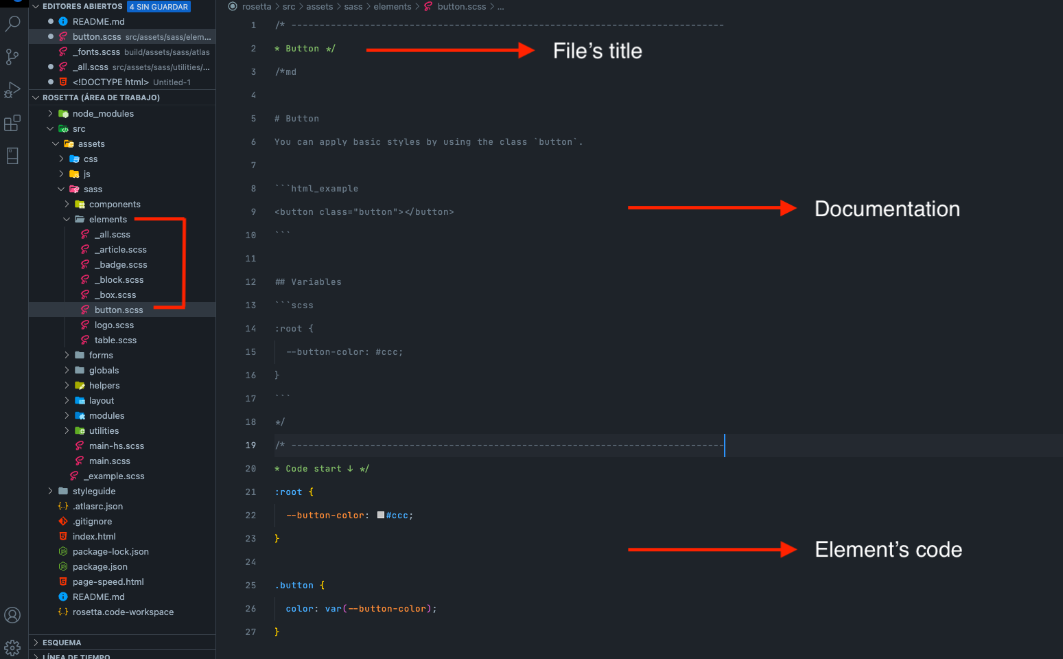
Every block inside Rosetta is a new .scss file with the name of the block inside the corresponding folder (e.g: if it's a file input element that we are working on, that file should go to the forms folder ) which will contains the markdown documentation and the styling code.
The idea is that you can write the block style code while you write its documentation, like "writing what you're doing". Documenting the block behavior and its modifiers.
Let's says that we're working on a button element. It's an element so it will go to the elements folder by the name of button.scss ( no underscore). Start by creating the main class, in this case, .button same name as the scss file, so you can start by what does this class do like You can apply basic styles by using the class button.
After we need to write the code and documentation for the button's diferent behaviors:
Will this button have different colors? We write a color section explaining the new behavior, how to use it and along with html examples with utility classes as needed ( if they are not declared in the helpers folder):
is-primary,is-secondary, etc.Will this button have different sizes? and width? We do de same as before and so on.
Note: when we write about a class or some coding staff we should use the markdown to generate a code block.
After finishing with the block, you will have to add it to the index.scss file and compile the rosetta.scss file to the rosetta.css file. You can do this at the beginning and set a sass watcher.
Long story short
Basics
When we create a new block (component, element, etc), a .scss file is created to start the documentation. In this way we document the created element while giving it styles.
Documentation must be written in English.
Each block consists of a title (it will be seen on its page), an introductory description, html examples ( as needed explaining what is being used) and the variables css used (always thinking that they can be redefined) if it is the case.
The block's variables are local (for each scss file) and go inside the root pseudo class unless it is a change of value due to modification. Ex: table.is-alternate { new variables or new variables values }
The mixins and utilities must go in the utilities folder to be imported into the necessary scss files. In this way we generate independence to each block and
index.scssfile to import.If the block has “Breakpoints modifiers”, a badge must be placed under H1 of the block documentation. This can save having to generate a table for each documented block. Se example
There are times when a block's documentation can have multiple sections (eg see Layout/Grid). Each section must be accompanied by a descriptive H2 of the same. Rosetta H2s have position sticky to make it easy for the user to kee an eye of the section where they are if the section is too long.
If the block consists of utility classes (eg: Layout/flexbox, grid), they must be in a table with the corresponding table headers. E.g:
| Class | Property |
|---|---|
flex-row |
flex-direction: row |
Generate HTML examples not only to give visibility of how code behaves, but also so that the code can be copied and used in a specific project. This HTML must have basic styles and modifiers should only be placed when necessary. Eg: in the
tableelement we have the option to alternate colors, as this option must be exemplified, we would create an HTML example with its modifier since if the user want that specific table they will use that modifier.If the generated HTML example has changes on different devices, place a "blockquote" that warns of that behavior in case the user want to try it. Example
Sintax
- The syntax of a block modifier must be accompanied by a prefix which can be "is-" or "has-". E.j: “is-primary” (a button for example) or “has-background-image” (if it is a module that has a background image and the styles must be treated in another way so that, for example, it does not affect the typography). These modifiers may or may not be global and must not contain the name of the block.
Modules
Modules would rarely carry styles of their own since we rely on most of them in Rosetta and its utility classes. Modifying how a module looks has to come from a module customizer that adds or removes these utility classes as in the case of a grid (by changing example columns), buttons and spacing.
Module examples should be clean (no unnecessary utility classes) and with the theme's data attribute ( data-theme="light") in the parent container of the module to display it in dark mode.
Other guidelines
After downloaded this repo, you will find a block-snippet.json file within the root folder. It contains a snipped shortcut ( rblock ) to generate the basic documentation for each block.scss file that you can add to your own shortcuts to speed up the process 🙂
Who do I talk to?
- Any suggestion or doubt you can talk to Jordi Cuenca, Victor Canelada or Emmanuel Umana. We're all ears 👂